Spotify
The Ringer
A digital platform where stories come to play
Spotify
The Ringer
I always wanted to create a site that was sports and pop culture. 30 for 30 had a big impact because I loved how that was about finding, empowering and working with these incredible directors, and I thought the same thing could work for writers.
Bill Simmons
Founder, The Ringer
A collection of modules designed to help the ringer curate their content in a way that’s both playful and organized.
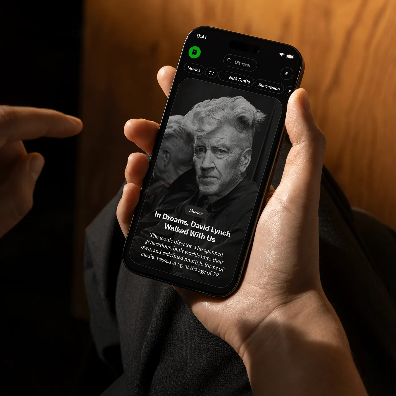
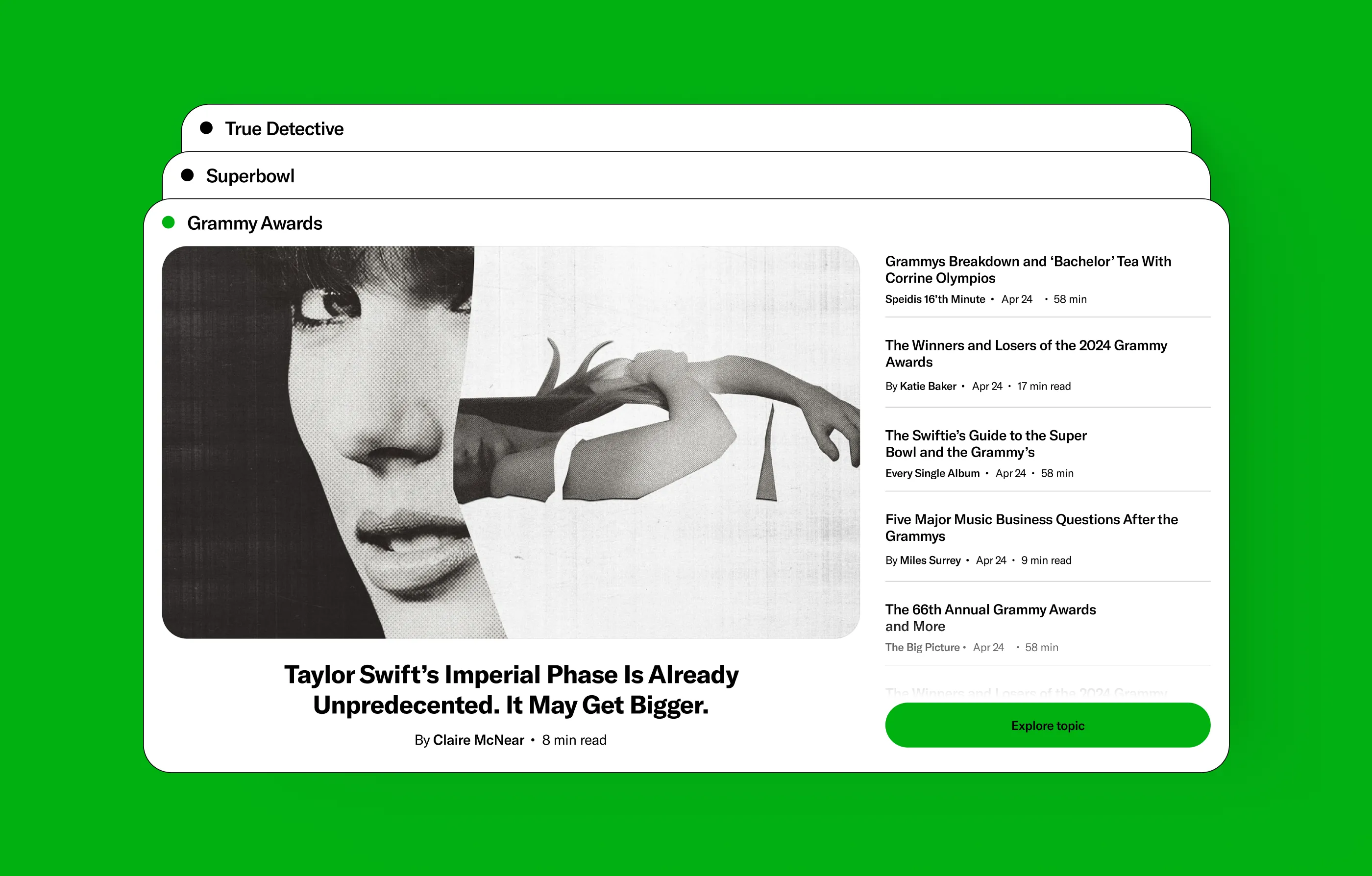
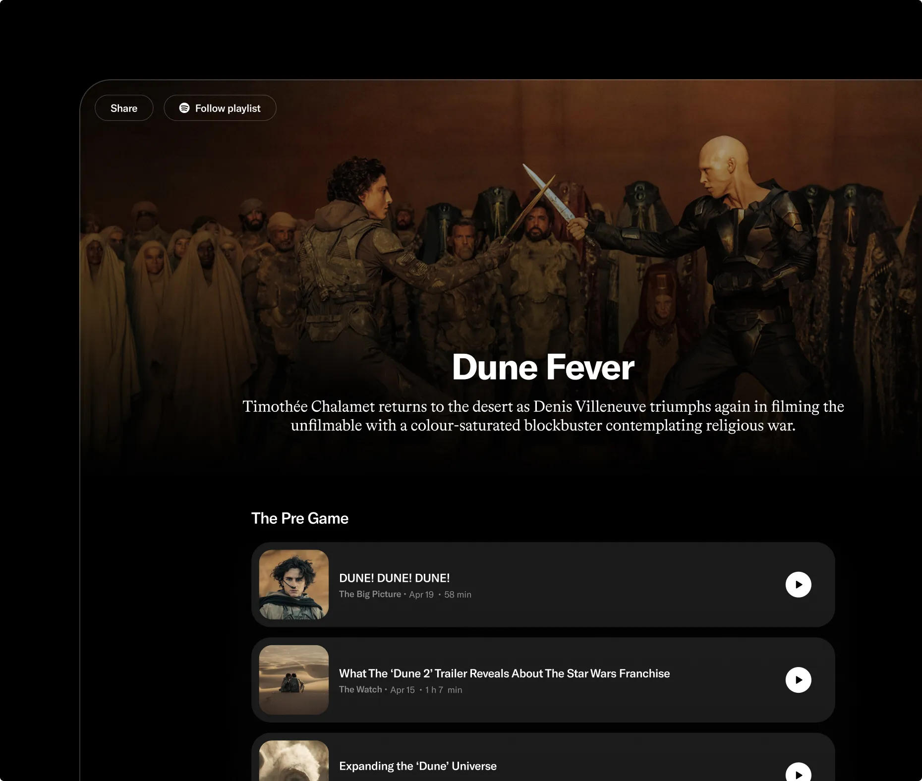
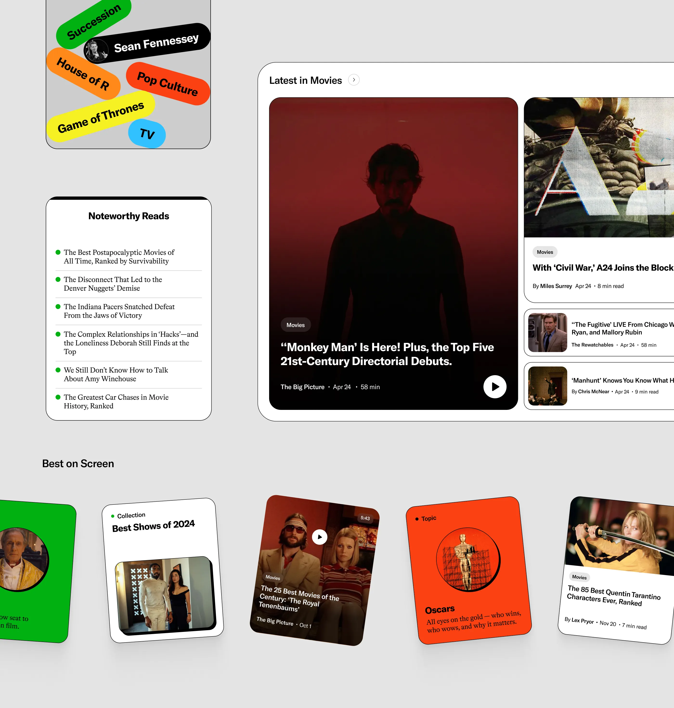
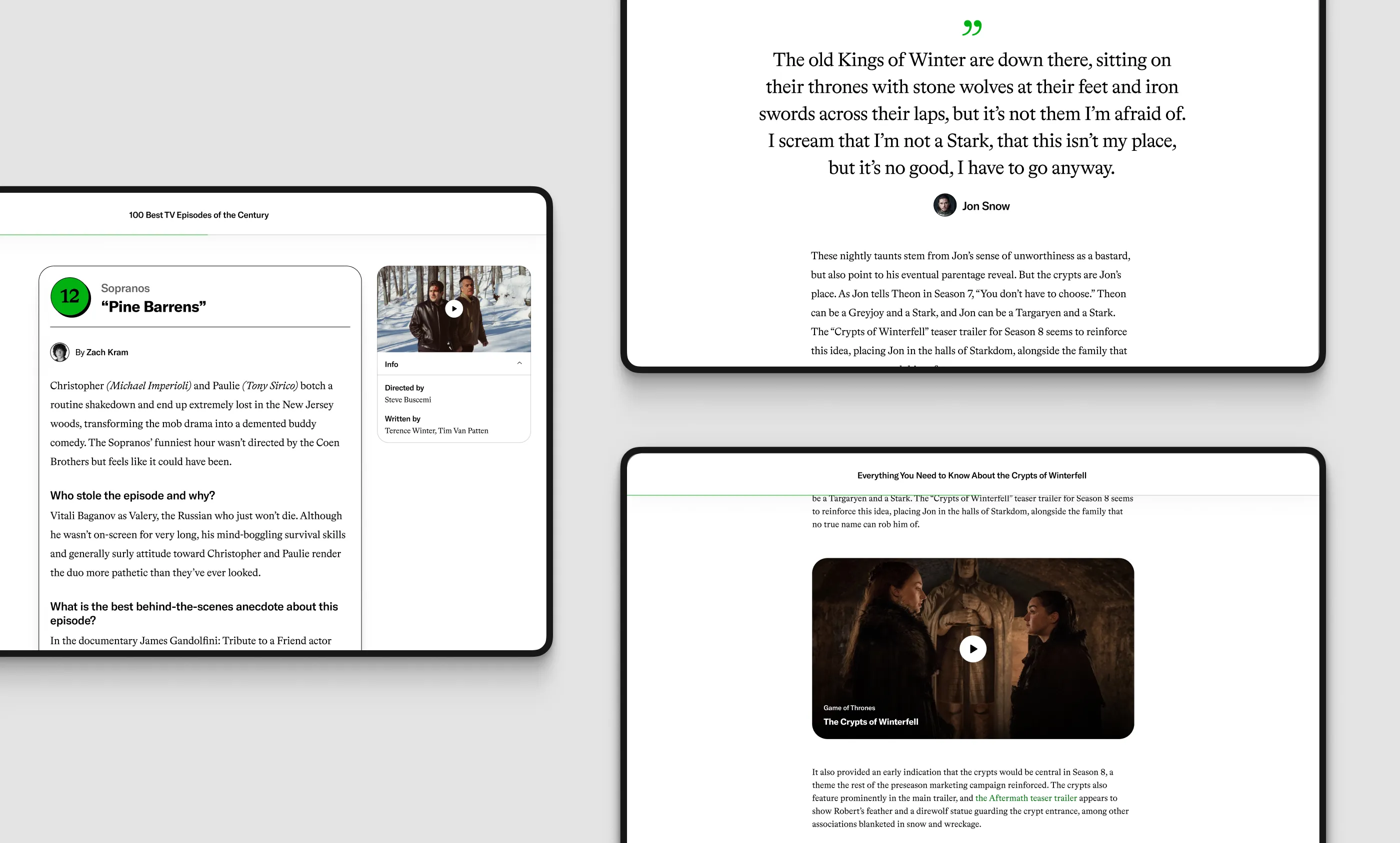
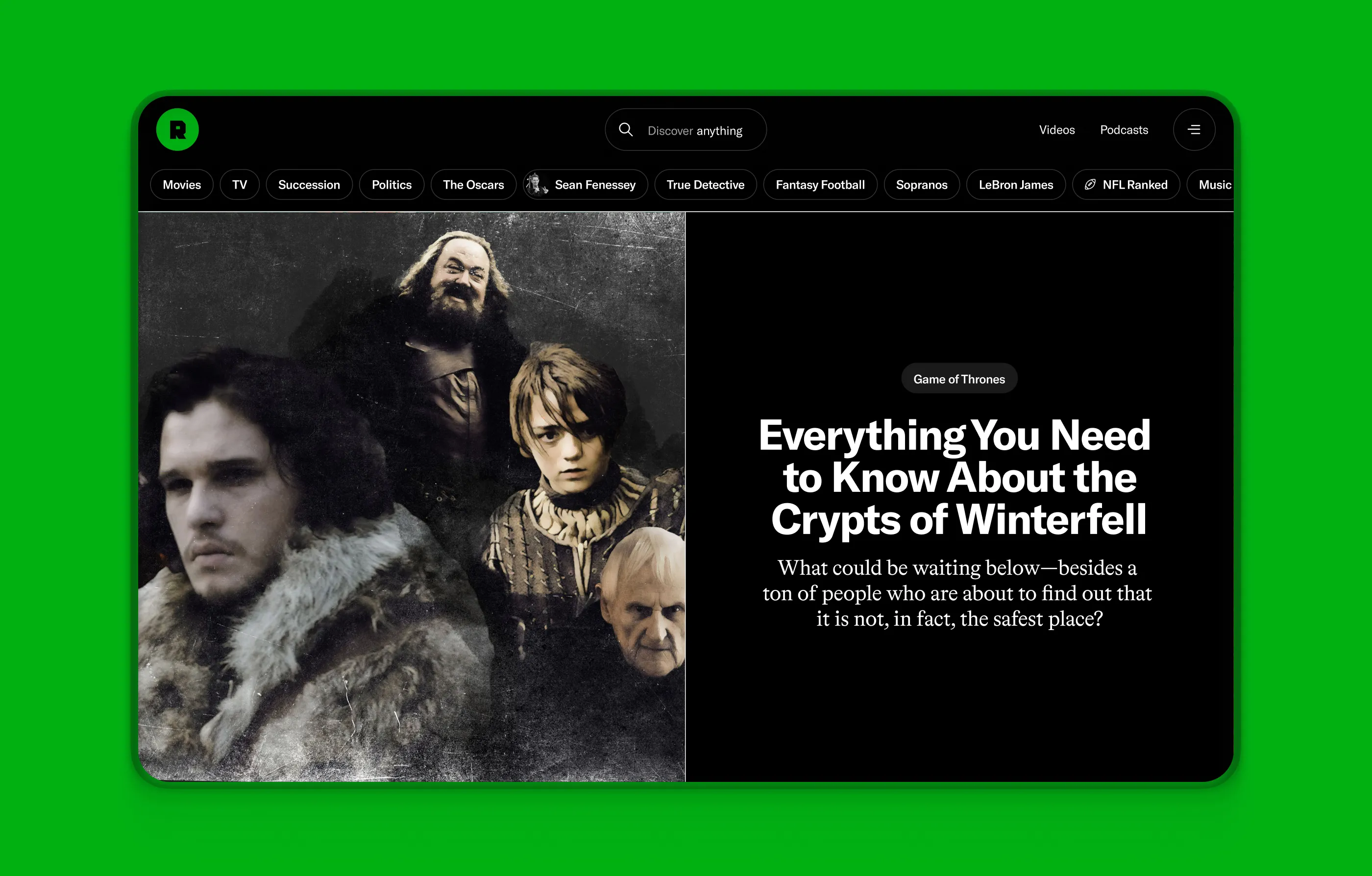
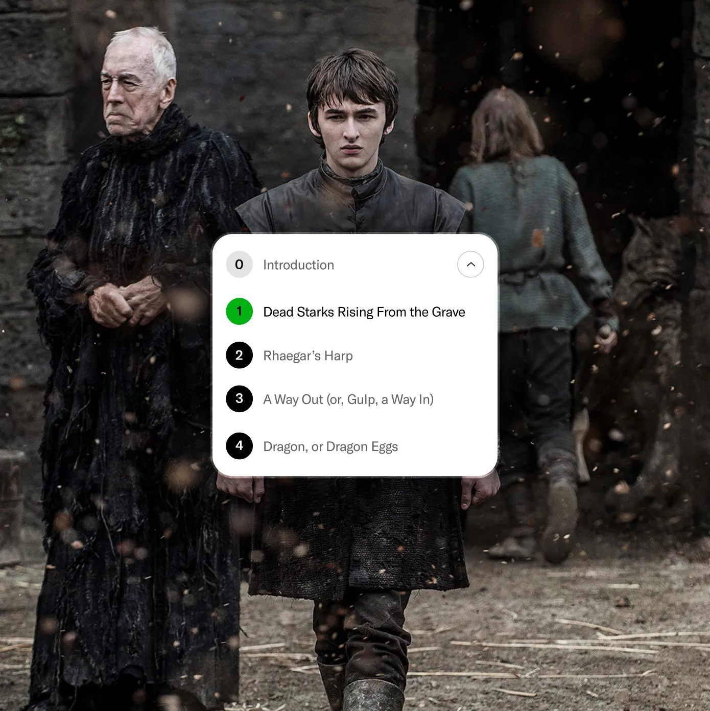
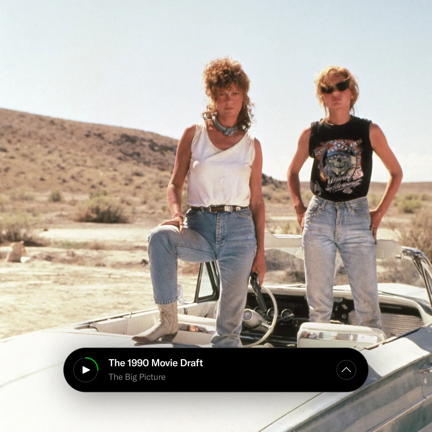
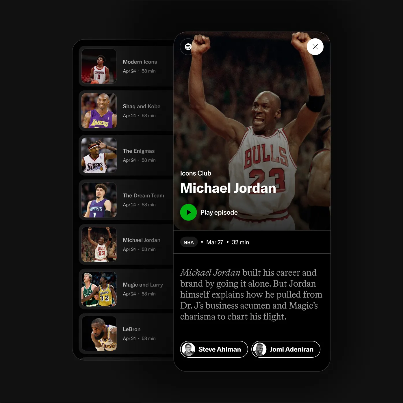
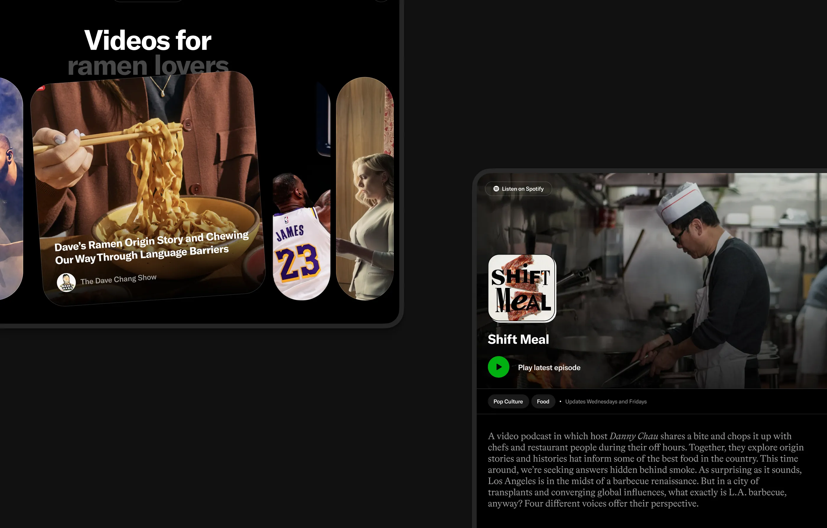
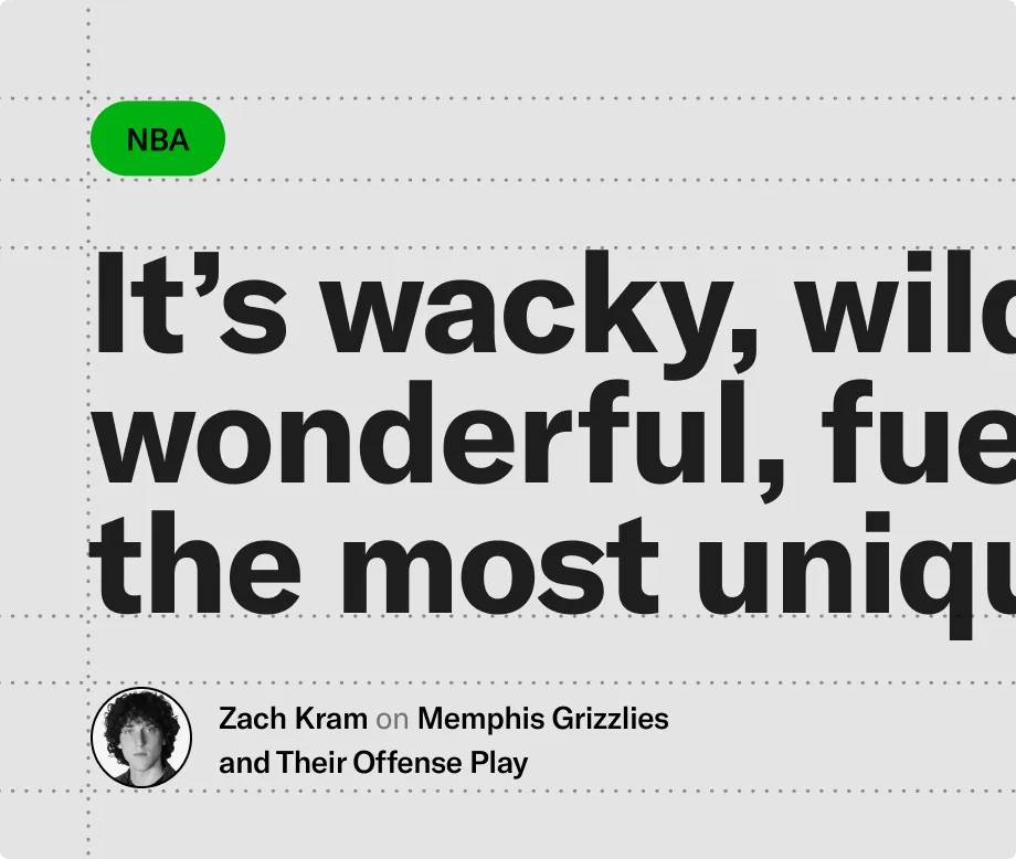
Writing has always been a core pillar of The Ringer. Covering everything from rankings and blog posts to long-form features, their content demands a system that adapts seamlessly to different storytelling needs. We designed a flexible framework with customizable modules, from tables and bundles to voting tools, supported by features like interactive footnotes and a distraction-free reading mode. All organized in a chapter menu that makes even the most detailed stories easy to navigate.
About
The Ringer is a Spotify-owned media company covering sports, pop culture, and entertainment through editorial content, podcasts, and video.It is known for combining sharp commentary, analysis, and personality-led storytelling across major leagues, film, television, music, and cultural moments.
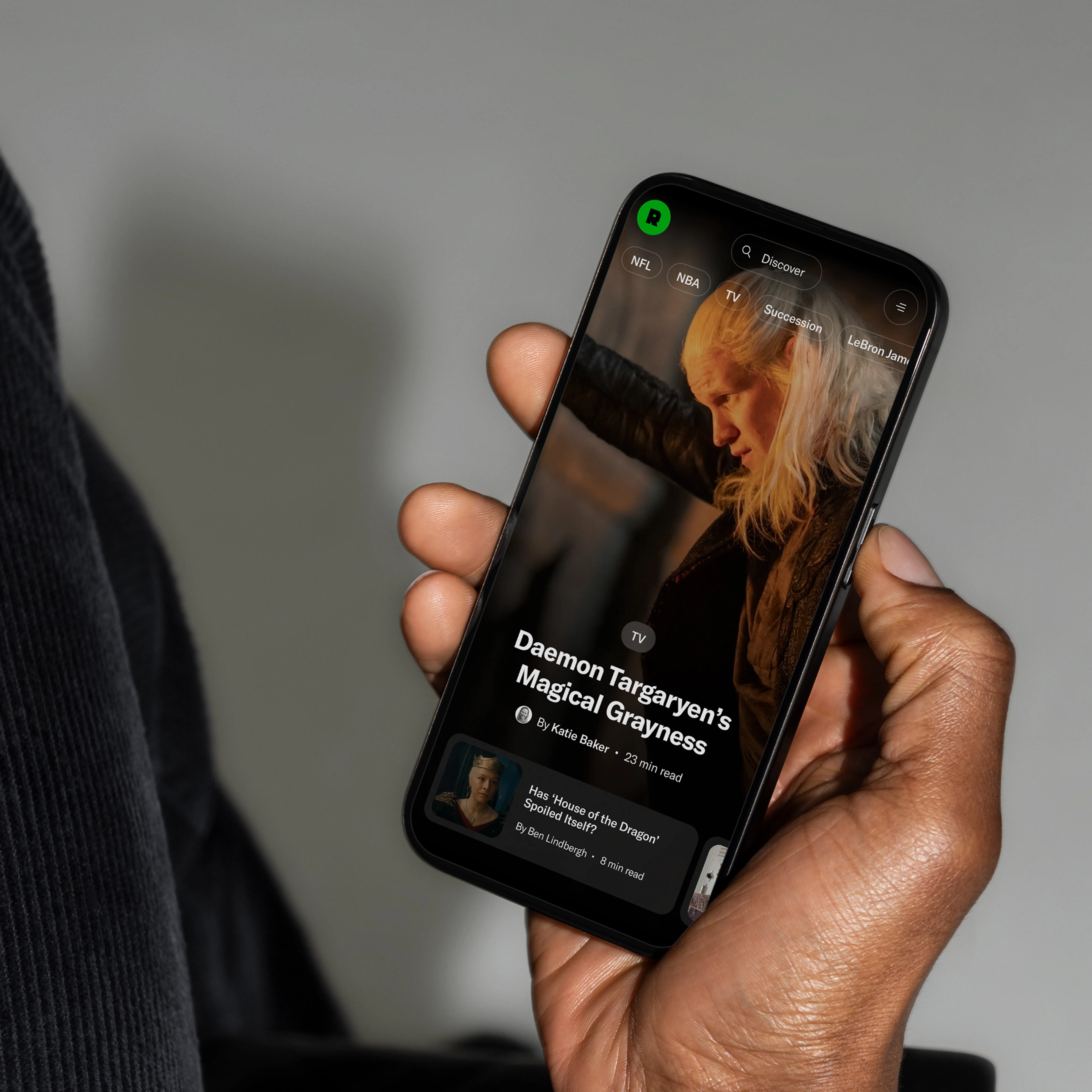
TheRinger.com serves as its digital home, bringing together articles, podcasts, video, newsletters, and special features for a highly engaged audience.
Year
2025
Design Capabilities
User Research
UX Design
Design Concept
UI Design
Design System
Tech Capabilities
Technical Architecture
Front-End Development
CMS Integration
Design System Implementation
Editorial Templates & Components
Interactive Editorial Experiences
Ad & Sponsorship Integration
Performance & Platform Optimization